/ Overview:
Client
Mark Evans, Pherotone Studios
Role
Creative direction
Visual identity
Mark Evans had spent a year building Pherotone Studios into something genuinely useful for guitar enthusiasts. Tone tests, mods, full guitar and speaker cab builds, all delivered with the kind of humour that makes technical content watchable. Helping people fix things, make things and break things, and having a laugh while doing it.
He had the right mentors and the right ambition. Rob Chapman in his corner. Andertons Music Co. and That Pedal Show showing what a guitar channel could become. But the identity hadn't caught up with the content. To take Pherotone to the next level, it needed to look as considered as the tone tests it was known for, without losing the character.
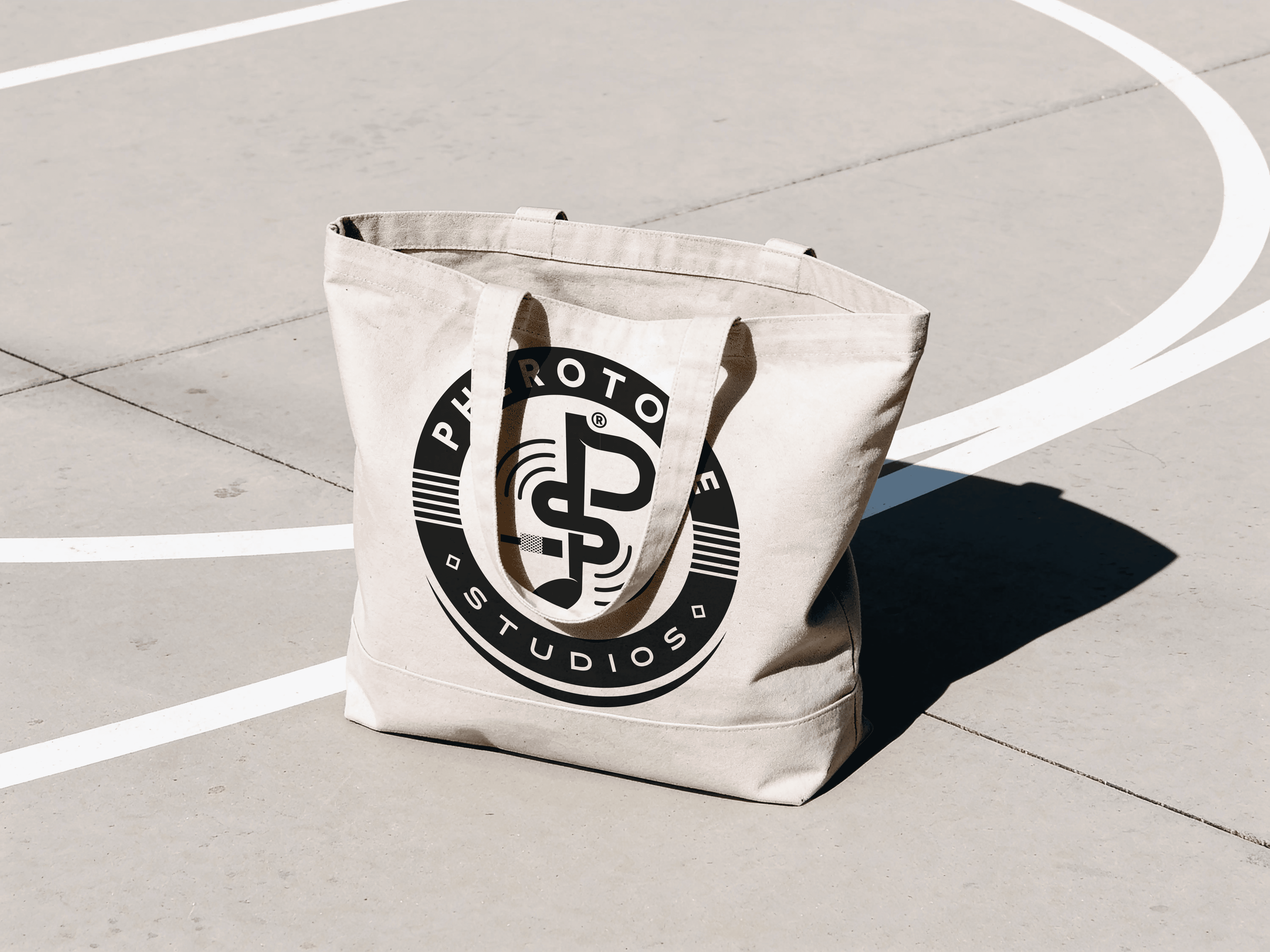
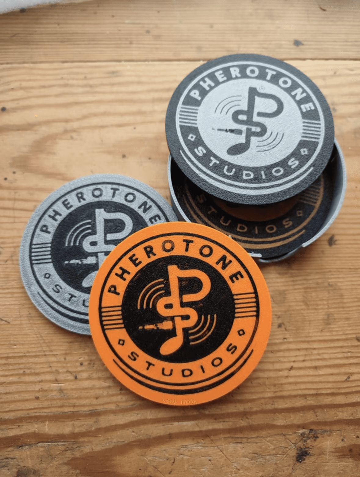
The mark had to earn its place in a crowded genre, so I went for a seal rather than a logotype that includes little visual cues; six guitar strings, an amplifier jack, and a musical note built from the P and S of Pherotone, set inside a circular badge that reads as contemporary rather than novelty. Alongside it, the spark, a distressed copper and teal starburst built to work anywhere the channel needed a stage.
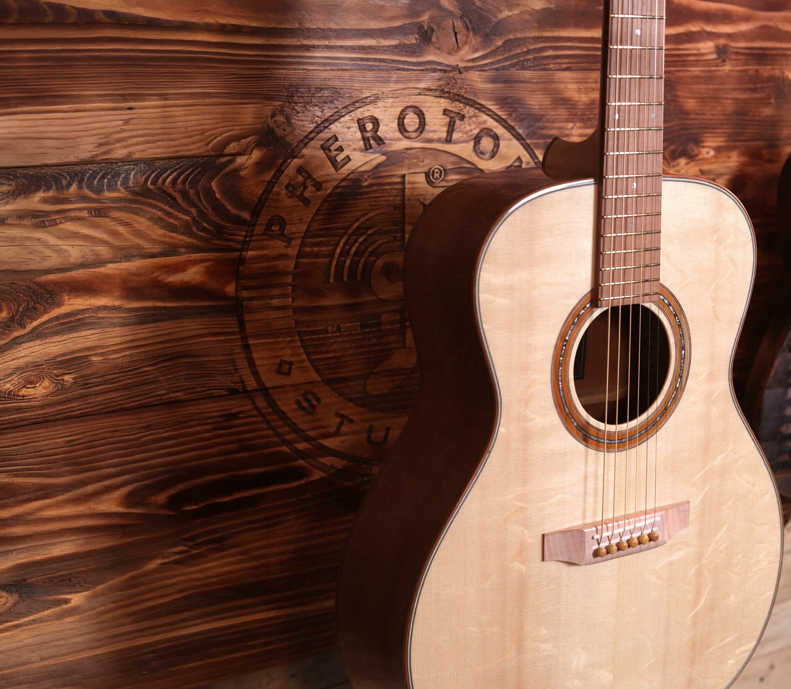
Mark took it further than most clients do. The spark now fills his on-camera backdrop and the screens behind every review. The badge has been routed and burnt into wood, printed onto tees, totes and - inevitably - beer mats.
Still fresh. Still distinct. Still exactly what a channel one step ahead of the crowd should look like.