/ Overview:
Client
Lee Anderton, Landlord FX
Role
Creative direction
Visual identity
Packaging design
Illustration
The idea started at the bar. A row of beer taps, each pulling a different brew, different colour, different flavour, different character. To anyone who obsesses over their pedalboard, that's a familiar feeling: reach for a different stompbox, get a different flavour of tone. Landlord FX built an entire range on that connection, from scratch.
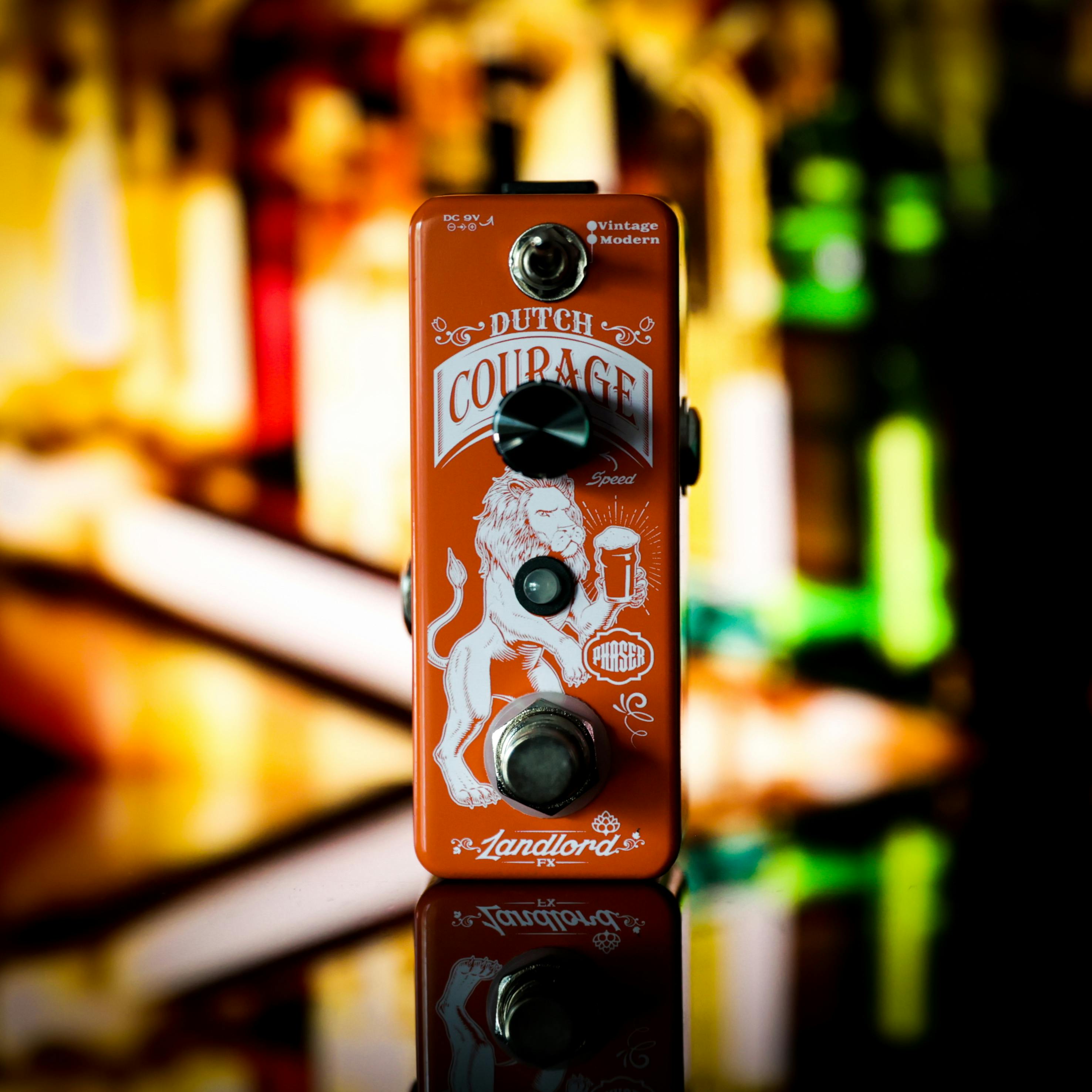
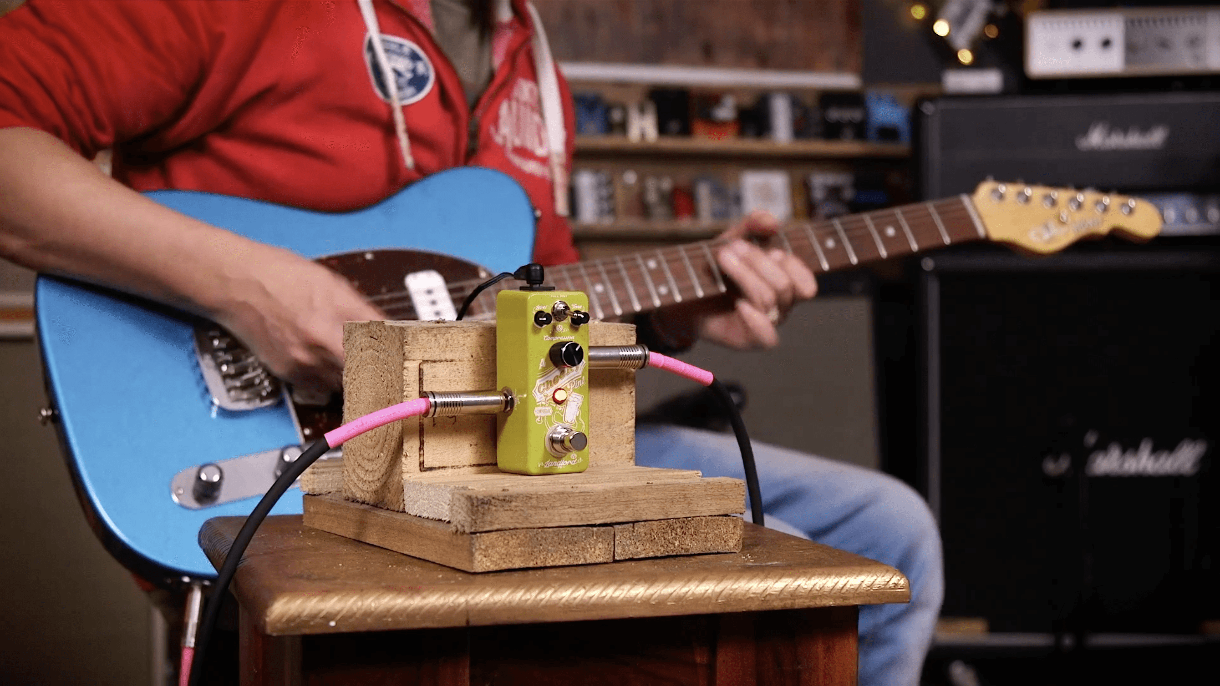
Ten pedals, each named after a night at the pub. Frothy Head for echo. Whiskey Chaser for distortion. Amber Nectar for overdrive. A Cheeky Pint for compression. The names practically wrote themselves, every one mined from the owner's own pub stories, and genuinely funny with it.
The challenge was holding ten distinct characters together as one confident range, on a budget that allowed for exactly one colour of print per pedal. No gradients, no shortcuts, nowhere for a weak illustration to hide.
The identity took its cue from pub signage and beer labelling - thick, confident linework, hand-drawn characters, a logotype with the unpretentious familiarity of a proper local rather than a craft brewery pretending to be one. Every pedal got its own illustrated scene, printed clean in a single ink, instantly recognisable as part of the same round.
The result: a pedal range that doesn't take itself remotely seriously, and sells because of it - opening the effects market to players who'd never normally look twice.