/ Overview:
Client
Michael Campbell - Cerberus Guitars
Role
Creative Direction
Visual Identity
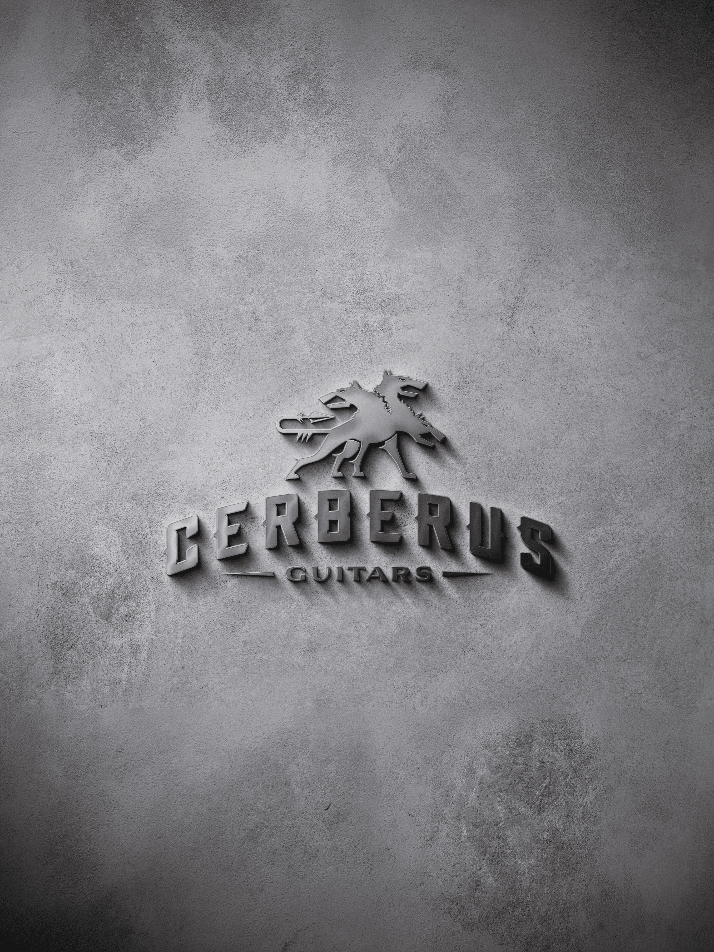
Cerberus takes its name from the three-headed hound that guards the gates of the underworld. A fitting mascot for guitars built for speed, precision and serious low-end weight. A boutique builder based in Texas, Cerberus had spent a couple of years earning a reputation purely on how the guitars played. The brand hadn’t caught up.
The starting point was the player, not the genre - the same speed, precision and control that dictate the instruments needed to define the brand around them. That happened to mean a metal audience this time. The thinking and approach behind it would hold for any product built on the same obsessive character, whatever the audience turned out to be.
That discipline shows most in what didn’t happen. The genre has its own visual shorthand, and it would have been easy to reach for every convention going. Instead, the identity borrows selectively, enough to feel authentically rooted, controlled enough to widen the appeal beyond the core audience to rock players who’d never call themselves ‘metalheads’.
The three-headed marque carries that same consideration for wider audience appeal. Built to stand entirely on its own, no wordmark required, it works as a genuine signature wherever the brand needs to show up - recognisable with or without the name attached.
Typography extended the thinking further: not one custom style but a full set, each font selection driven by a different playing technique that defines the genre, so the way the brand reads echoes the way the instruments get played.
The result: distinct rather than generic-genre, precise, controlled, and built to travel well past the audience it started with.