/ Overview:
Client
Theramex
Role
Creative direction
Visual identity
Femarelle is a range of hormone-free food supplements, developed to support women through menopause. The product was proven. The way it talked to women wasn't.
The packaging couldn't move, a licensing constraint meant it stayed exactly as it was and every other piece of communication had been built to match it for years; stock photography that told no story, iconography so clinical it looked embarrassed by the very thing it existed to talk about.
That was the real problem. Health brands default to dwelling on symptoms. Femarelle needed to talk about the woman on the other side of them.
The taboo got tackled head-on rather than softened. Each symptom became a character instead of a euphemism. A moon for night sweats, a cactus for dryness, a flaming star for hot flushes - witty enough that women recognise themselves in the joke rather than looking away from it.
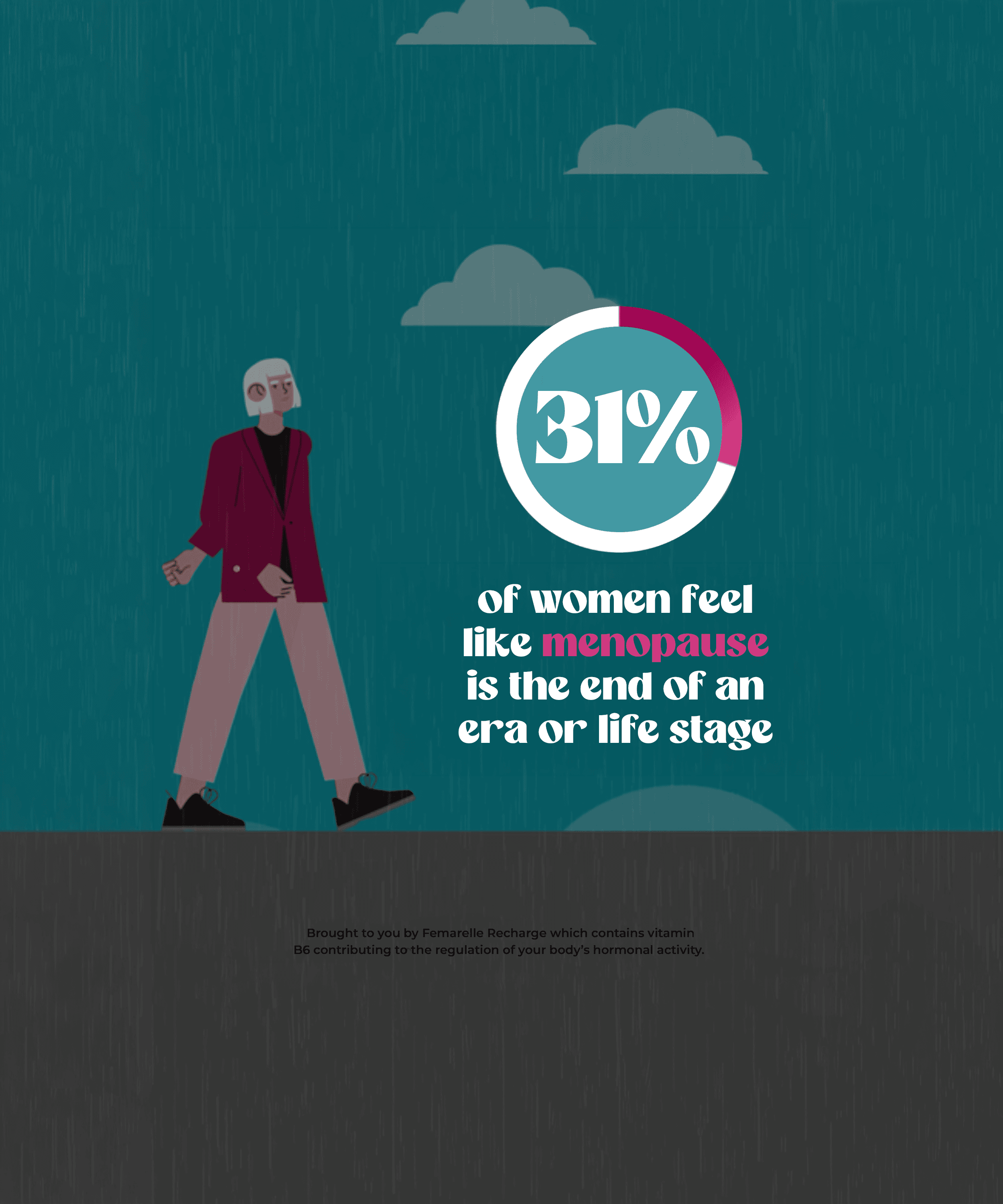
That cast of characters did more than replace the old stock photography, it replaced what stock photography could ever do. A photograph can only show a woman having a bad day. An illustration can show her physically booting the symptom out of the frame. That kind of cheek, that level of expression, only exists because it's drawn.
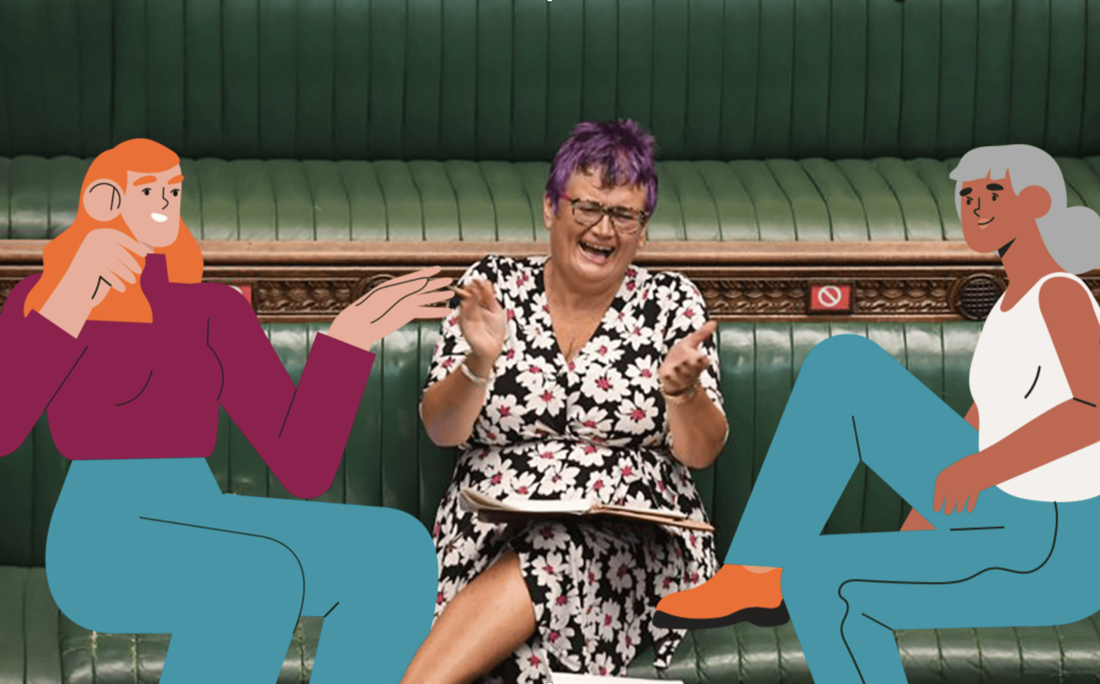
The characters extended further still, appearing alongside real photography, flanking real women in real settings, part of the scene rather than decoration on it. Illustration and photography working as one system, built to keep telling new stories rather than repeat a single static image.
Copywriting matched the confidence. Life Unpaused: a line that plays on menopause while saying something bigger - this stage isn't an ending, it's a continuation, on the woman’s own terms.
The logo held its ground where it mattered, the existing logotype staying and keeping pack and brand connected, but gaining a flag device with real range. Colour-coded across the three product variants, multicoloured as the single mark that pulls the whole range together.
Evolution on the surface. Revolution underneath.




Designed in collaboration with Rachel Gray