
/ Overview:
Client
Aora Aesthetics
Role
Visual Strategy
Creative Direction
Visual identity
Brand guidelines
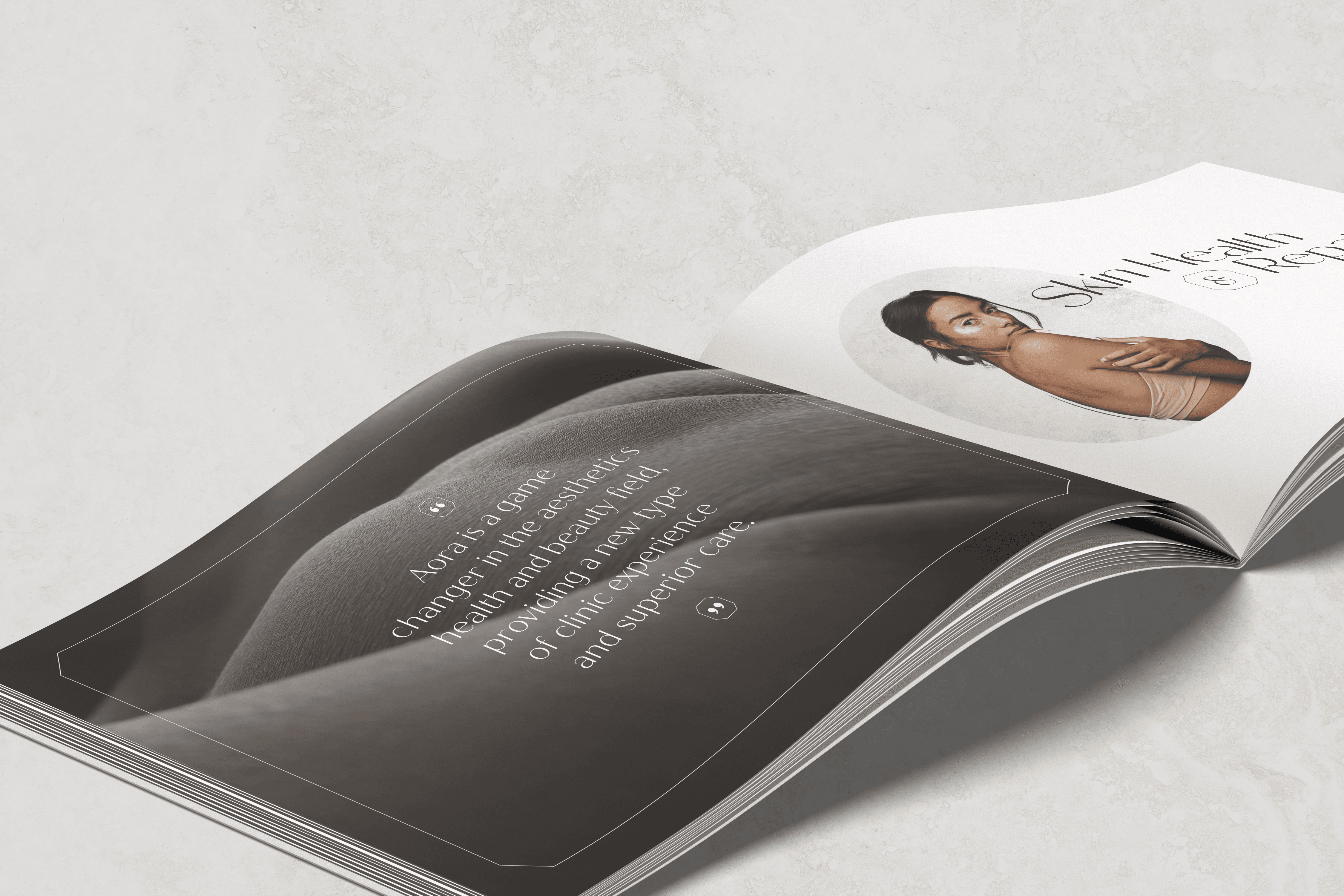
Aora is a non-invasive aesthetic clinic, built around top cosmetic surgeons delivering the very best of their field to a high-end clientele. Every part of the experience needed to match the calibre of the care; considered, exceptional, and worth the trust being placed in it.
All too often aesthetic clinics have a default look: white, clinical, minimalist to the point of feeling faceless. Safe but sterile, the visual language of a hospital, not a luxury experience. Aora was never going to be that. The results on offer were beautiful. The brand needed to be too.
That still left a genuine tension to solve. Luxury tips into arrogance easily. Aora needed the opposite: quality that felt open rather than closed off, refined without holding anyone at arm’s length.
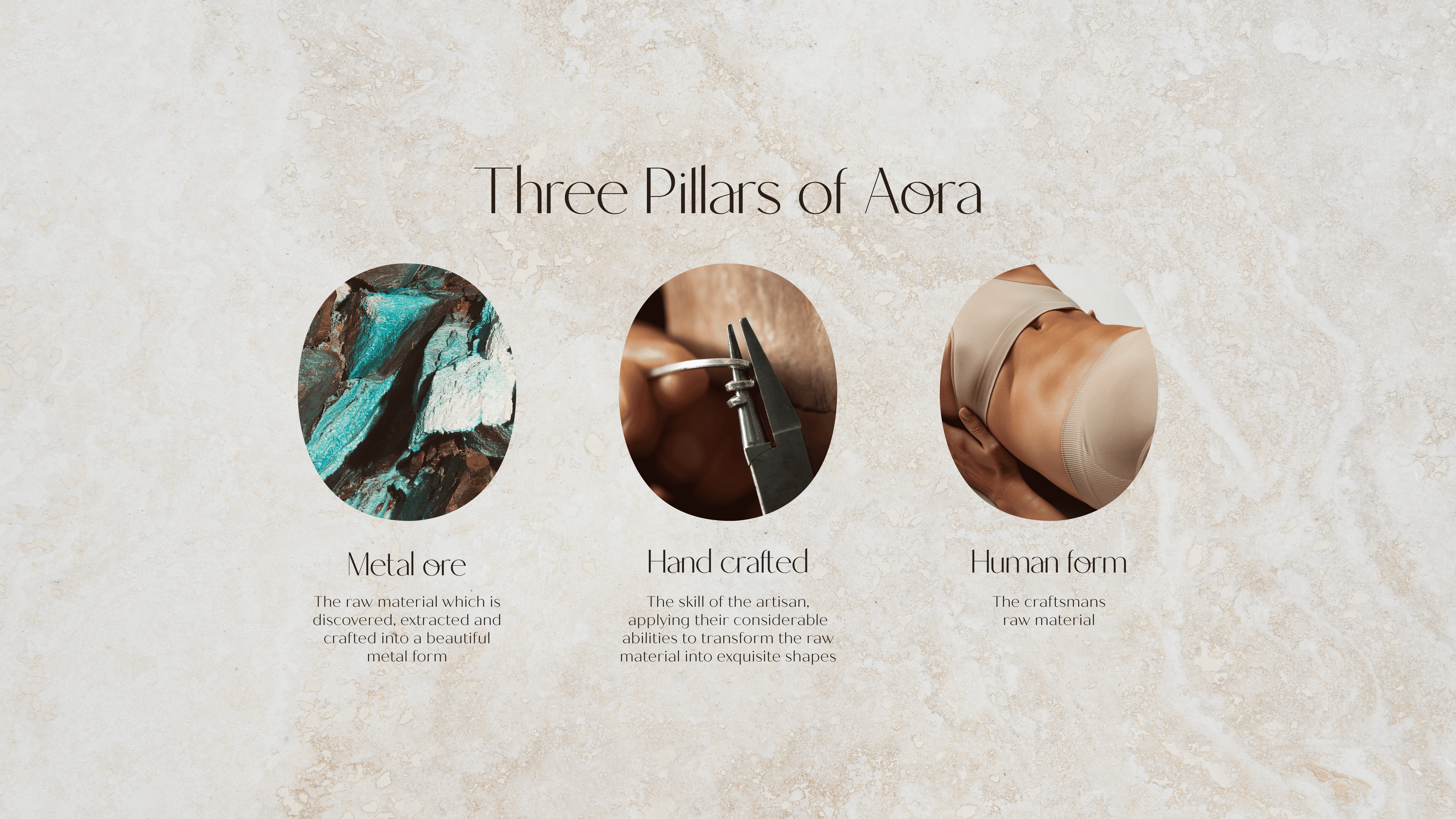
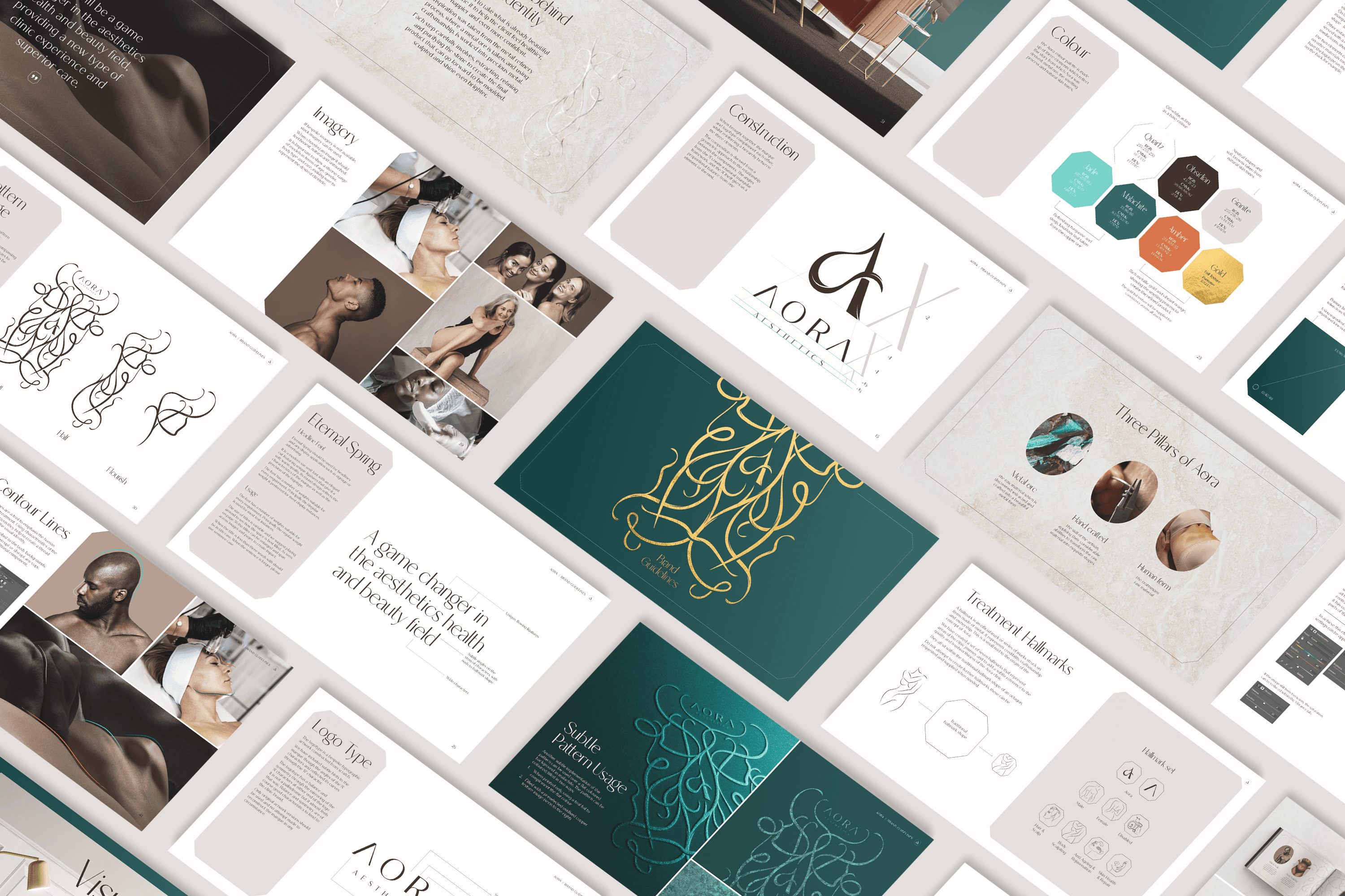
The answer came from an artisan’s workshop rather than a clinic. Raw metal, shaped by skilled hands into something of real beauty. A metaphor for the precision behind every treatment, and the foundation everything else was built on.
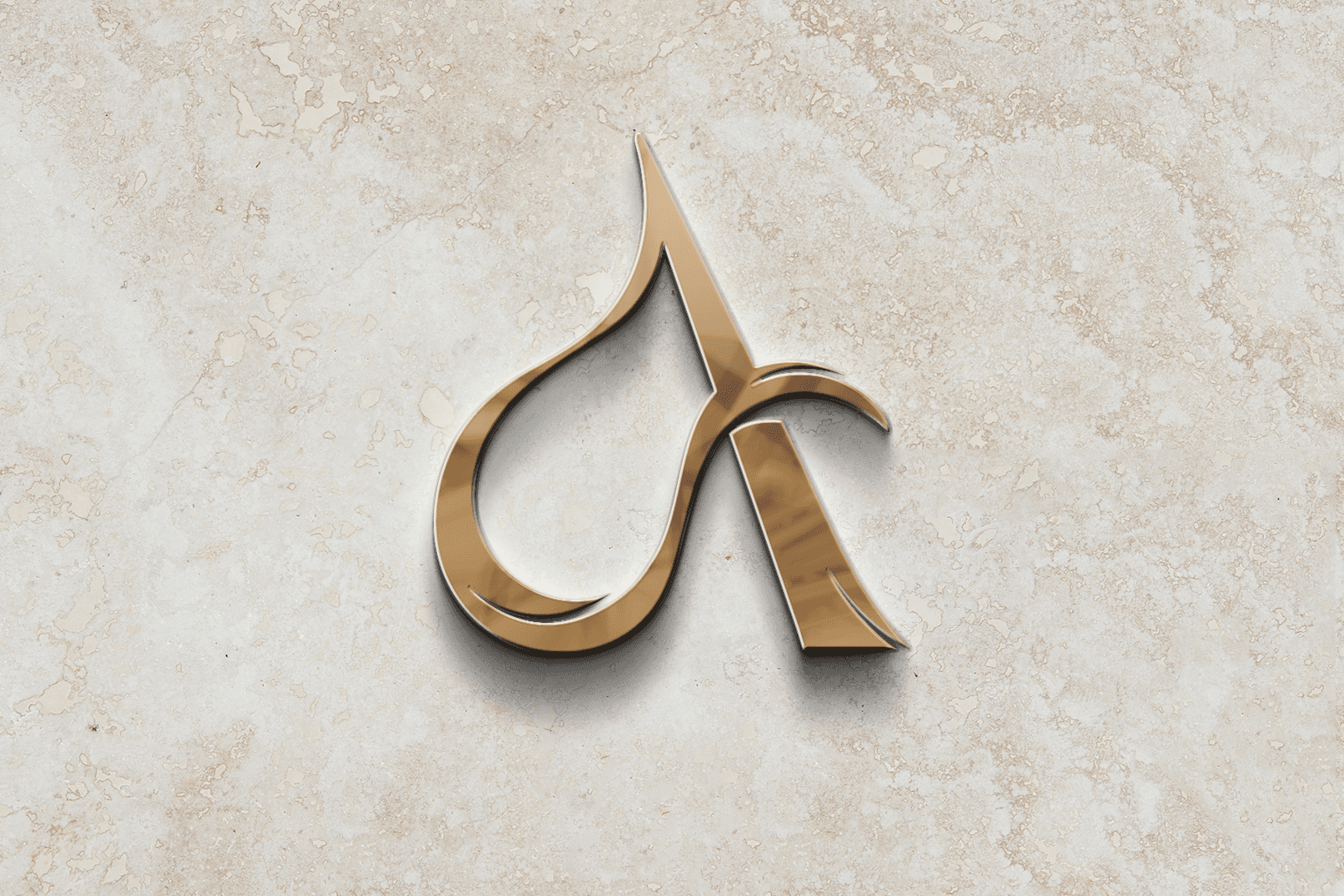
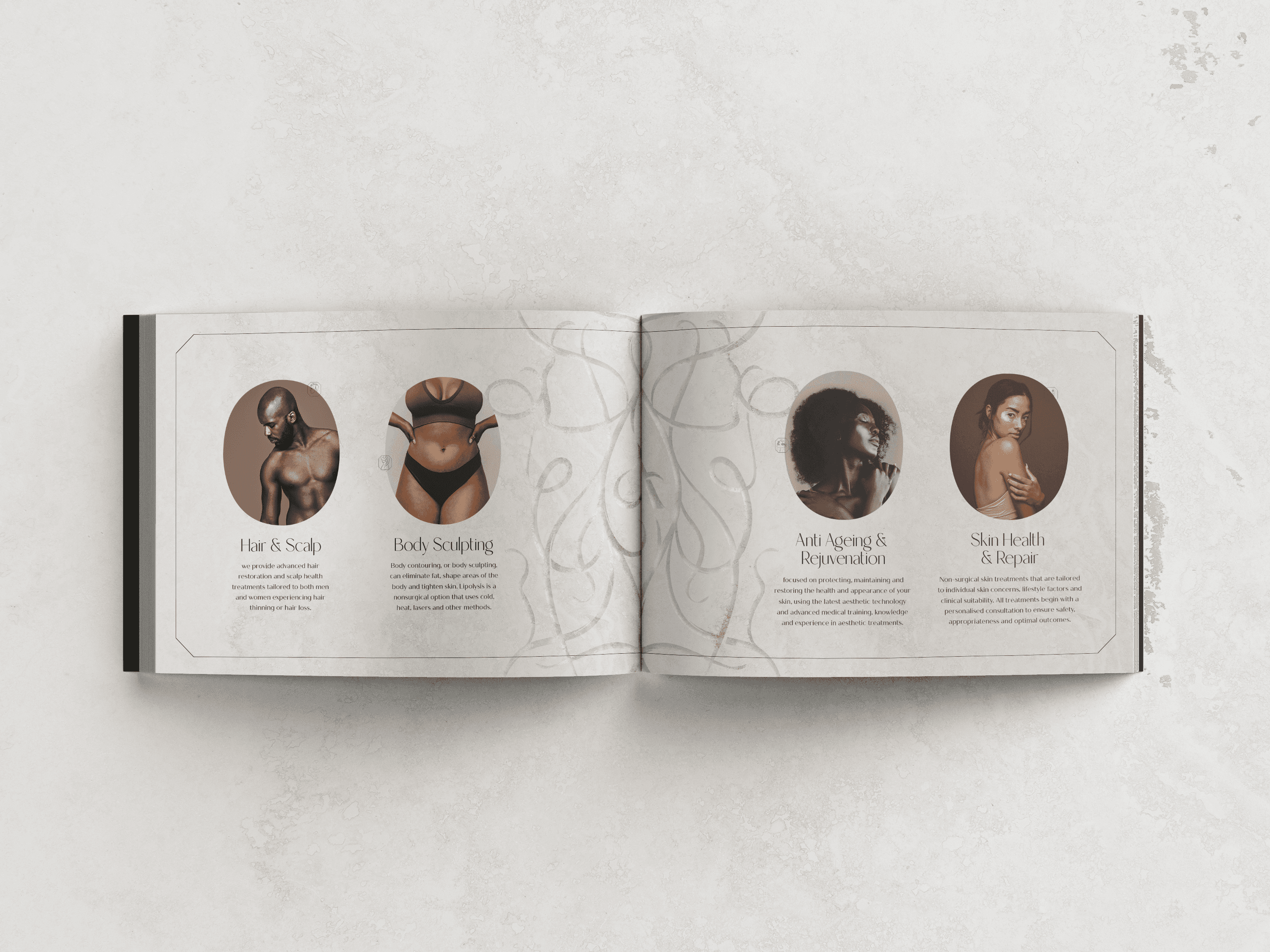
A sculpted metal insignia became the brand’s marque, formed to stand as a three-dimensional object rather than sit flat on a page. Alongside it, a beautifully crafted treillage panel with sweeping curves drawn from the human body itself, elegant rather than literal. A set of custom hallmarks extended the language further, marking quality the way a goldsmith would.
Colour carried the same warmth: malachite green, burnt umber and gold, amber standing in for the forge fire at the centre of the metaphor. Those tones ran straight through into the physical world too with marble, stone, leather, gold leaf, plush velvet finished with jade stitching - so the identity could be touched, not just seen.
The result: a brand rich enough to match the experience it represents, human enough that nobody mistakes it for a waiting room.







Designed in collaboration with Rachel Gray


