/ Overview:
Client
Woods Health
Role
Creative Direction
Visual Identity
Illustration
Animation
Woods Healthcare had been delivering vitamins and supplements direct to customers since the eighties. Long before anyone called it D2C, Woods had built a loyal following, predominantly older customers who trusted the brand, valued the prices, and kept coming back.
The problem was that everything about Woods looked like what it was: an old school mail order company. The brand hadn’t kept up with the business. And the growing online supplements market was bringing new, younger competitors who looked considerably more exciting.
The strategic challenge was delicate. Evolve the brand enough to attract a new generation of health-conscious customers without unsettling the loyal base who already loved it. Make it vibrant without making it unrecognisable. Make it emotional without making it soft.
The answer came from an unlikely place: birds.
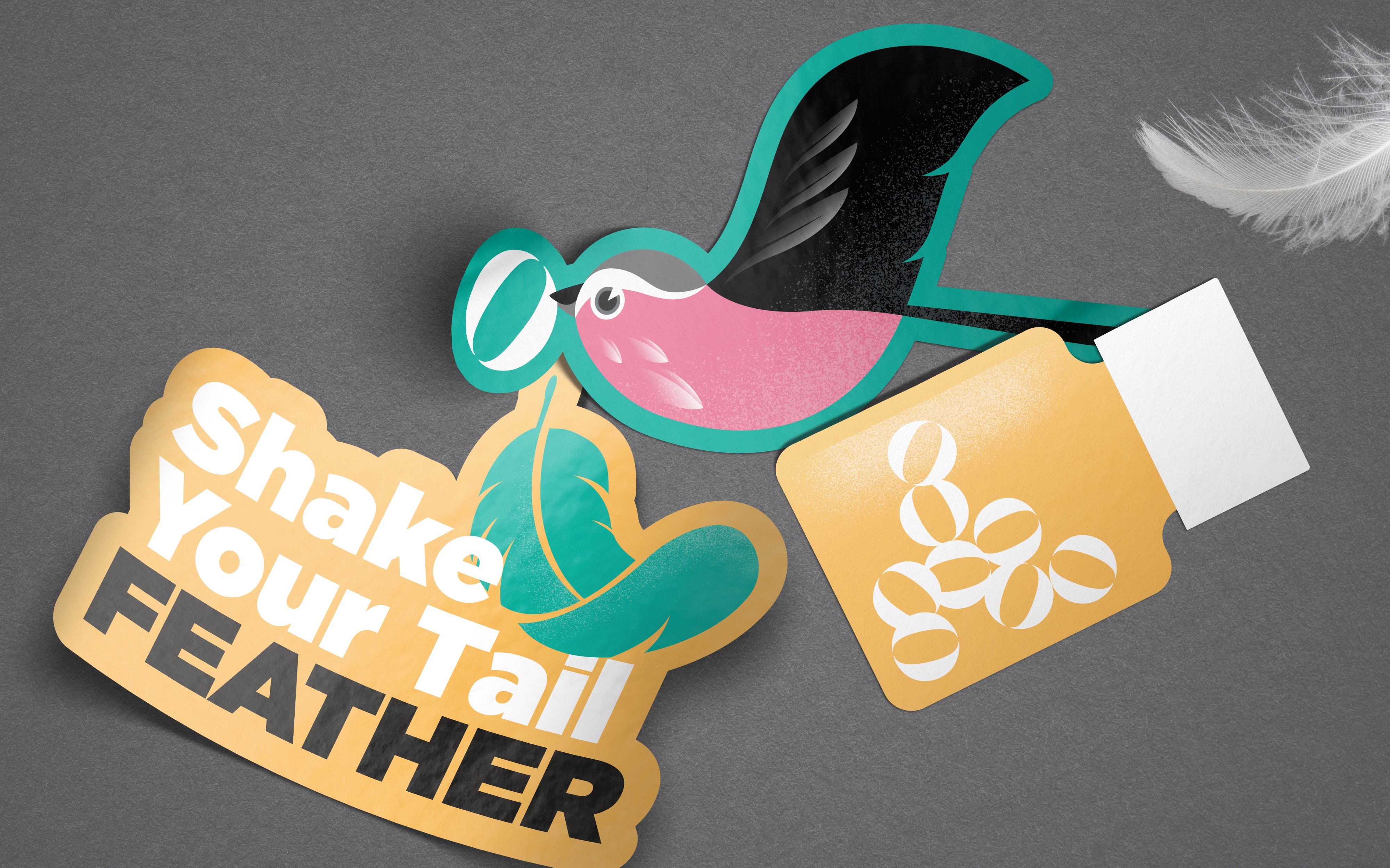
My research showed that birds are commonly used to symbolise care, but also delivery, which connected directly to Woods’ heritage as a mail order brand. A family of illustrated birds became the heart of the identity. Bright, characterful, each species chosen for its colour and personality. The Woods Flock.
The creative connections multiplied from there. A bird’s beak, seen from the front, forms a perfect W (too nice to ignore). The double-O in Woods already mimics the round shape of a supplement capsule, which guided the logotype directly. Even the copywriting found its wings, the bird theme lending itself to warmth and wit in a category that usually communicates in dry, functional language.
On-pack, a single feather hints at the birds without showing them, as if they've just delivered and moved on.
Simple. Characterful. Fun. The kind of idea that makes you wonder why nobody thought of it before.
The project won multiple Transform Awards. I think it deserved every one!