
Every business needs a story.
When you’re building your brand, strategists and designers will encourage you to find the thing that makes you genuinely different. Build everything around it. And make it unmissable.
When I decided to go freelance, I had to take my own advice.
Which, as it turns out, is considerably harder than giving it!
I’d spent over three decades in agencies, working with brands like Virgin Atlantic, Transport for London, Asda, Schwarzkopf Professional, as well as smaller businesses like renowned music retailer Andertons Music Co. (which I’m still incredibly proud of). I’d won awards as both designer and creative director and I knew what good brand work looked like.
But sitting down to find my own story? That was a different thing entirely.
The first question was: what do I actually believe?
I believe in character. In warmth. In work that feels like it came from a real person rather than a committee. That every business, big or small, deserves to benefit from good brand building. I’ve always been drawn to identities that have personality baked in, work that makes you smile before you know why, that looks like it belongs to someone specific, that has something genuinely worth looking at beyond the logo sitting cleanly on a white background.
There’s a lot of very beautiful, very polished, very minimal design in the world. I have enormous respect for it. But it’s not what I do, and it’s not what I want to do. I wanted to build something with more texture. More character. More warmth. Something that felt human rather than architectural.
The second question was: where am I now?
I’d moved from London and Surrey to Somerset. A deliberate choice - a new chapter, a new landscape, a new way of living. And Somerset is a place with extraordinary character. I wanted to embrace it, and make it a major part of my new persona. Not as a marketing position, as a genuine reflection of where I'd landed and who I'd become (and an exercise in taking my own medicine).
So I started looking for something local. Something distinctive. Something that felt like it carried meaning.
I work from a studio with a view I genuinely couldn’t have imagined when I was commuting into London. Outside my window: deep greens that shift from almost black to vivid grass depending on the season. The electric turquoise of a clear Somerset sky. The acid yellow of gorse on the hillside. And the orange (a vivid, almost luminescent orange) of the wildflower Fox and Cubs that appears in summer along the lanes.
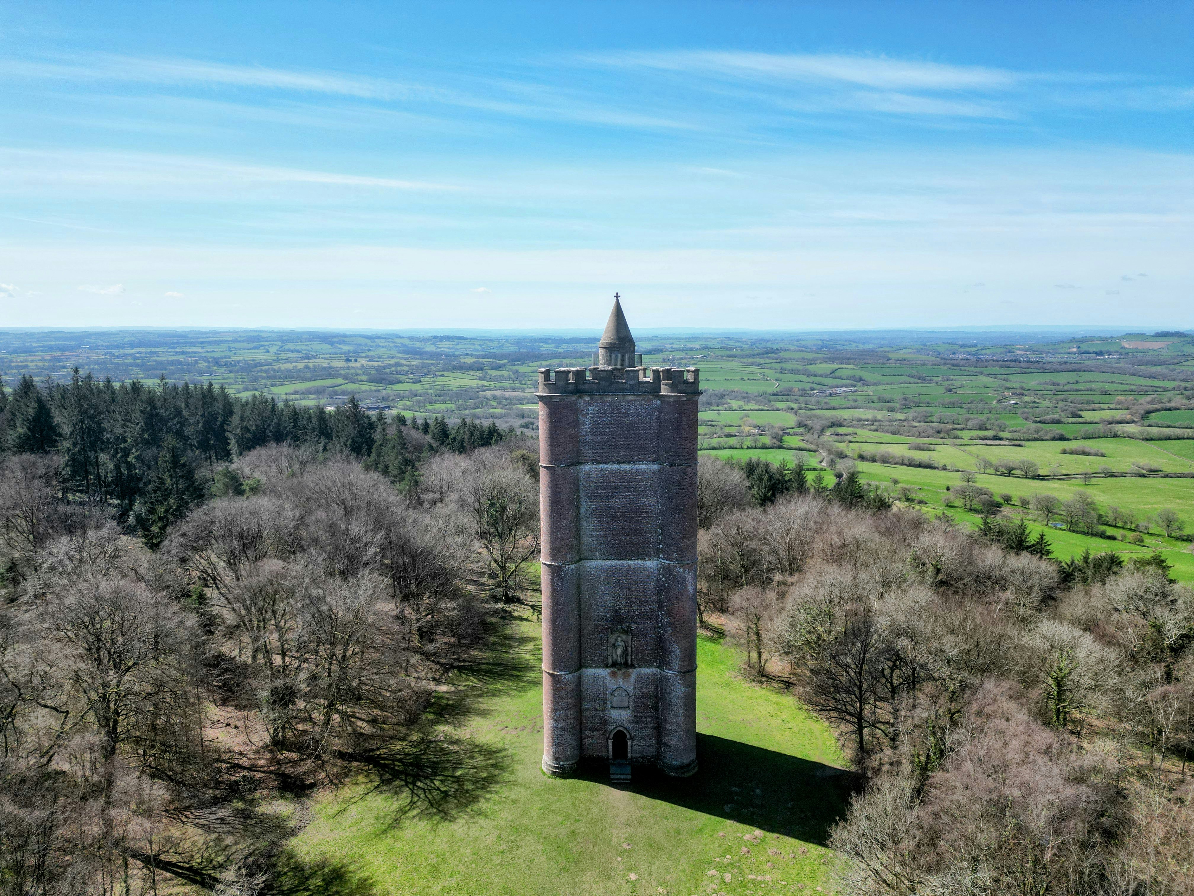
Those colours became the Studio Fuzzpig palette. Not chosen from a trend report or a colour theory exercise, but taken directly from the world outside the window. It felt important that everything about this brand should come from somewhere real.
And then I discovered that the old Somerset word for a hedgehog was fuzzpig.
I knew immediately it had potential, not just because it was cute, though it is, obviously. For a start the hedgehog, as a creature, is a near-perfect metaphor for what I believe about branding.
Distinctiveness is key. In the British countryside, the hedgehog is about as singular as nature gets. Five thousand spines. Nothing else like it anywhere on this island. You cannot confuse a hedgehog with anything else. In a field full of brown furry things, it stands out completely.
That’s what every business needs. Not to shout louder than the competition, but to be genuinely, unmistakably itself. So distinct in character that it simply can't be confused with the alternatives.
It’s also underestimated. Most people don’t know that hedgehogs can swim. And climb. And run at six miles per hour. Small doesn’t mean limited. Small doesn’t mean slow. The hedgehog covers more ground in a night than anyone expects.
That felt right for a sole practitioner who’d spent thirty years learning things that make a concept land, and what makes a client say ‘that’s us, that's exactly us’.
There’s also the personality. Warm, a little prickly, slightly mischievous. There’s an old English myth that hedgehogs steal milk from cows - biologically impossible, but revealing about how the creature was once perceived. Clever. Resourceful. Gets what it needs by unconventional means.
That felt really interesting.
And then there’s the visual world the hedgehog opens up.

The Fuzzpig character itself; a spiky ball that unfurls into a striking, expressive star shape, became the central visual device. Infinitely variable. Never the same twice. The same creature, showing up differently in different contexts, always unmistakably itself. It works as a logo, as an illustration, as a container for typography, as a graphic element that can carry a piece of work or frame a photograph.
The star shape and the ball are the same thing. One closed, one open. One a restricted and constrained version, one showing up in its full potential. That tension is at the heart of everything Studio Fuzzpig does.

But the hedgehog world doesn’t stop there.
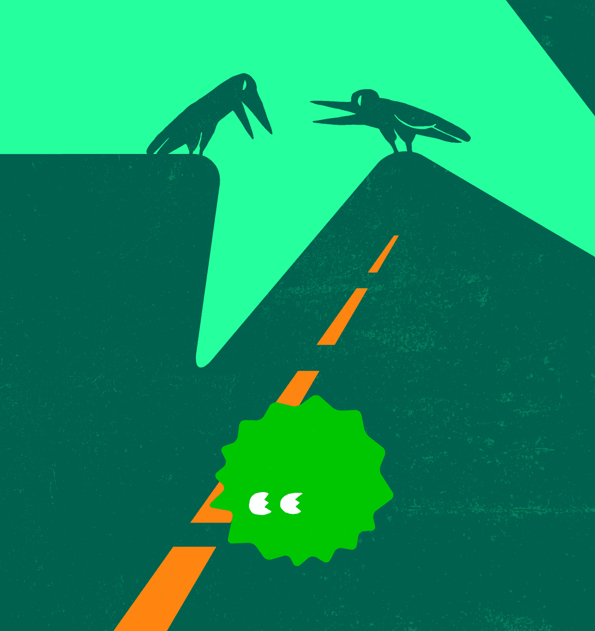
The natural world that surrounds the hedgehog is full of useful characters. Crows (those sharp, opportunistic, slightly ominous birds that appear everywhere) became the visual shorthand for anything that threatens a business. The competition that all looks the same but is ready to pick at your bones should you fail. The market pressures that make it tempting to go quiet. The instinct to curl up and wait. Wherever the crows appear in the Studio Fuzzpig world, they’re the thing to be aware of, to be smarter than, to outmanoeuvre.
And then there’s the language.
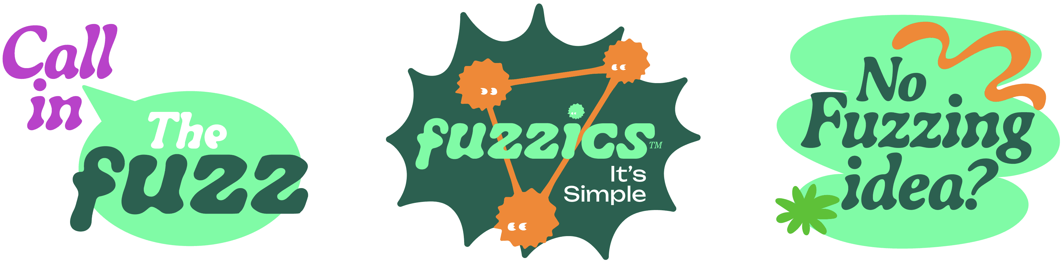
The name Fuzzpig is rich linguistically, and Fuzz, it turns out, is a remarkably versatile component. Replace the opening syllable of almost any word and something unexpected happens. Your story is Fuzzinating. It’s fuzzitively fantastic. What’s all the fuzz about?
It sounds ridiculous. It is. But, presented in a characterful typeface, it’s also ownable in a way that no other brand in the sector can replicate, because it comes from a real place, a specific name, a genuine story. The wordplay isn’t decoration. It’s an extension of the character, woven into the way the brand speaks and thinks and presents itself to the world.
This is what I mean when I say the name is the method.
Everything about Studio Fuzzpig - the colours from the view outside the window, the character that unfurls from a defensive ball into a confident, expressive form, the crows and the ants and the hedgerows, the Fuzz wordplay that runs through the copy - comes from somewhere real. None of it was designed to look impressive in a portfolio review. All of it was built to be genuine.
That’s what I try to do for every client.
Find the real thing. Build everything around it. Make it difficult to overlook.
Welcome to Studio Fuzzpig.


